(1) The Standard Dashboard for Everyone
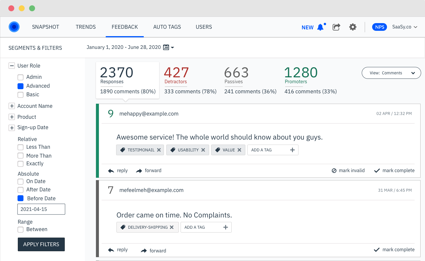
Wootric started off as a survey company providing easy code-based NPS/CSAT/CES surveys any company could use. Plug the code into any channel and it would work.
With that we needed the Standard Dashboard a free customer could land on before any upgrades. Even though over the years, I wanted to upgrade it the analytics said customers liked it.
Weekly Actives kept rising, few customers reported confusion, and reporting was just enough to satisify CX managers who would use screenshots in their Executive Reports.
(2) The Enterprise Executive Dashboard
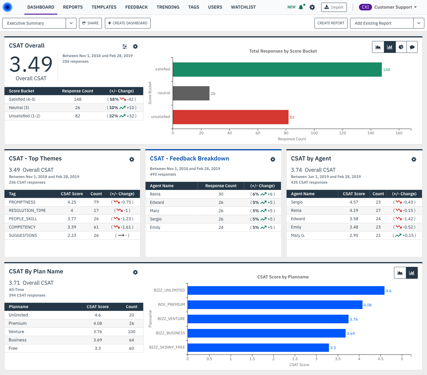
Problem: Enterprise Customer receive millions of responses that are near impossible to analyze. How do you give them tools to analze feedback in the millions?
Customers like DocuSign, Zoom, Glassdoor, etc. were used to exporting spreadsheets of responses and creating their own dashboards. But this was always a manual process for those involved. Some of the more advanced customers used BI tools like Tableau. But it wasn't a user friendly experience to do what they wanted.
After many customer interviews here was the list of features we came up with:
Primary Feature List: Custom Dashboards, all feedback from all sources centralized in one place, actionable insights, and automatic categorization of feedback.
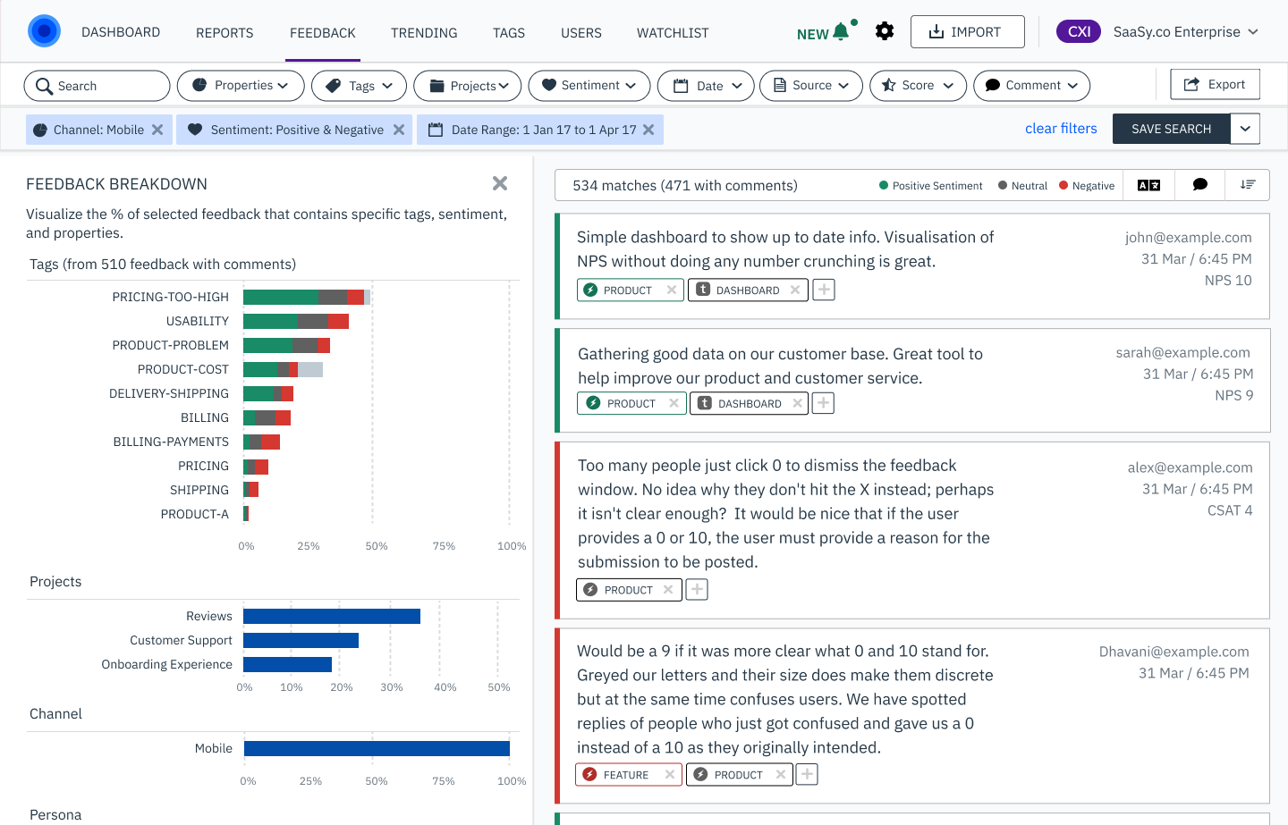
(2a) Feedback Breakdown - the disconnect between your data and the UI
After user testing, one major user issue remained that was only possible to catch from watching sessions. Users didn't know what their data looked like as they filtered and explored their surveys. Too they'd click to filter their data, and their would be 0 results. This wasn't because of us. Looking deeper into it, it was because too often customers passed user segments with no values. They'd have a property called "company_name" that was empty. And another property called "company" with all the data.
While we had all of their survey feedback, we had no control over what data they passed us. In most cases, the stakeholders using our product had little control within their company either. Data cleanup is an corporate wide issue that effects all industries.
The Feedback Breakdown allowed customers to see the breakdown of data before doing anything. They could see what segments already existed, how much data was in any given segment, and be able to click into it to dive deeper.
The result was the Feedback page was by far the most used page by Enterprise customers. Spending over 80% of their time on this single page.
NOTE: The problem we solved is still a major issue I see industry wide across CX dashboards. Segmenting your data and viewing the results usually exist on different pages. And unless you pass the cleanest of data, their is no way to know what will work beforehand. It's a major reason why I think no one likes dashboards.
(3) AI/ML Auto-Categorizing Feedback
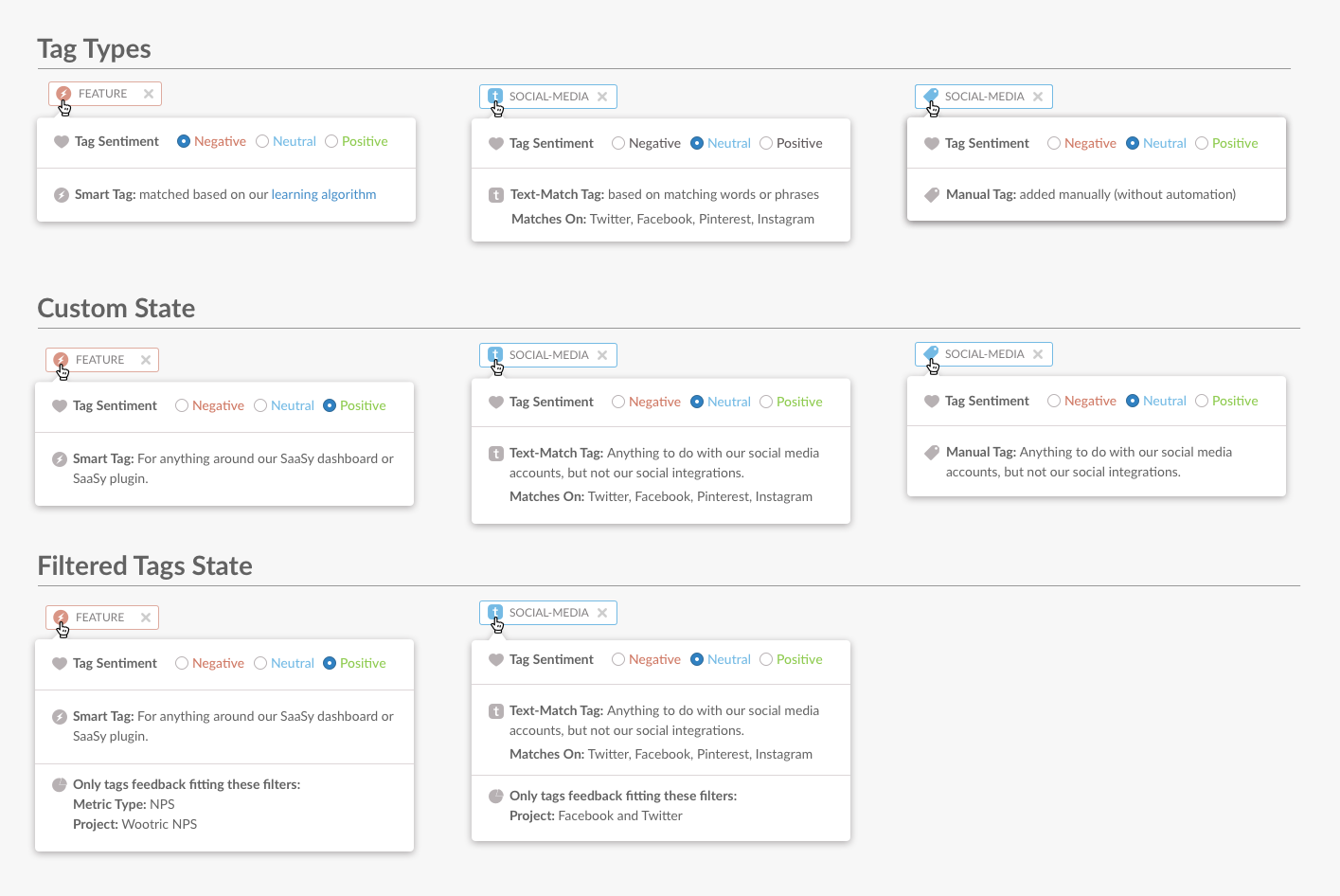
To scale for Enterprise customers we needed to categorize their feedback automatically into meaningful groups. From their, the data could tell more of a story. For that, we used Tags, which utilized three different types.
- Smart Tags were designed to match based upon Machine Learning and plenty of training data.
- Text Match Tags were made to allow users to add text-specific phrases for tags to match to like "Credit Card" when the tag is BILLING.
- Manual Tags were for those who wanted to add there own categories without automation.
On top of using Tags, Sentiment was also applied to each feedback and tag-- giving the user even further categorization.
Because this is a lot of information, every tag could be hovered over to understand how it works, what sentiment it is, and how it was applied.